Heartburn—a burning sensation that millions deal with regularly—might not seem like the most exciting or cinematic topic for advertising. But leave it to Gaviscon, one of the UK’s most trusted antacid brands, to turn this uncomfortable condition into a visual and emotional metaphor.
The brand’s latest campaign, known affectionately by fans as the “firefighter ad,” has reignited public interest (pun intended) in how health products are marketed. Using larger-than-life firemen to represent fast, targeted heartburn relief, the Gaviscon ad blends humour, science, and smart storytelling into a 30-second triumph.
In this article, we’ll explore the background of the campaign, its creative concept, visual style, and why it’s such a burning success among UK viewers.
The Creative Concept: Meet the Gaviscon Firefighters
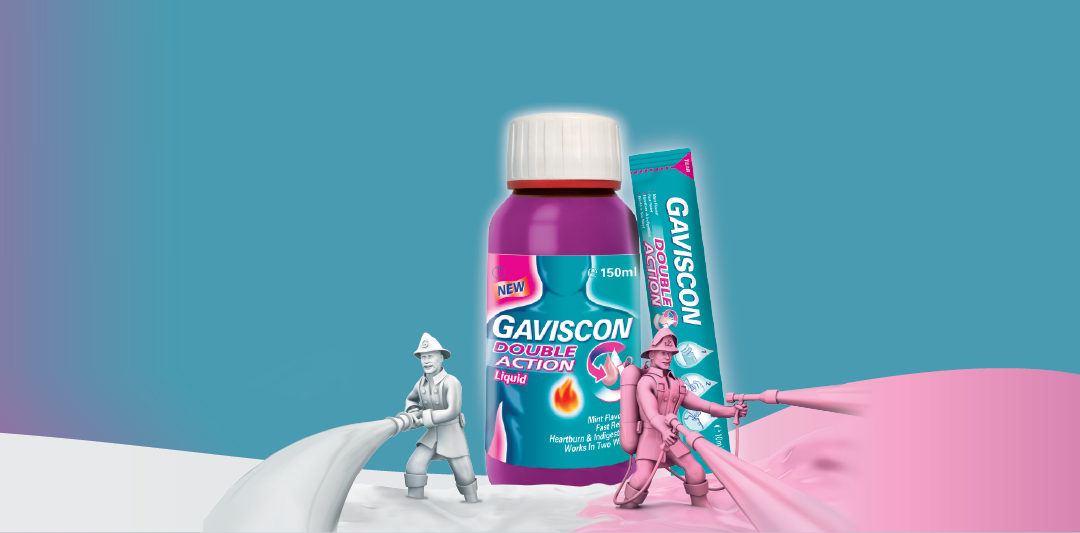
Launched as part of Gaviscon’s long-running theme of “Fighting Heartburn Fast,” the campaign’s most memorable ads feature miniature firemen who spring into action inside the body to combat heartburn flames.
When the protagonist eats something spicy or acidic—a curry, a greasy burger, or too much tomato sauce—his face contorts in discomfort. Suddenly, alarm bells ring, and we zoom into the stomach. A team of Gaviscon firefighters, decked in flame-retardant suits, slides down poles, boards tiny fire trucks, and sprays a soothing liquid foam directly onto a blazing stomach lining.
The fire dies down instantly. Relief is felt. Life goes on.
This quirky concept is more than just entertaining—it’s an intelligent metaphor for how Gaviscon works to form a protective barrier that stops acid from rising back up the esophagus.
How the Ad Reflects the Science of Gaviscon
Many pharmaceutical ads struggle to explain what a product actually does without losing the audience in medical jargon. Gaviscon’s brilliance lies in turning complicated gastrointestinal science into relatable, visual storytelling.
Gaviscon products contain sodium alginate, derived from seaweed, which reacts with stomach acid to form a gel-like raft that floats on top of the stomach contents. This barrier prevents acid reflux and soothes the esophagus lining.
The ad’s use of firefighting foam perfectly mimics this process in a way that’s both accurate and easy to grasp. Just as fire foam smothers flames, Gaviscon’s “raft” soothes the burning sensation of acid reflux.
This visual allegory educates the audience while entertaining them—an ideal mix for health advertising
The Visual Style: Clean, Colourful, and Cartoonish
Unlike the dramatic, symptom-heavy tone of many pharmaceutical ads, Gaviscon opts for a light-hearted, cartoon-like aesthetic that makes the experience feel less clinical and more accessible.
Key visual features include
- Bright red flames inside the body to depict acid.
- Glossy CGI firemen—small but mighty—with oversized helmets and hoses.
- A colourful internal landscape, making the human body seem like a high-tech control centre.
- Real-world scenes before and after, showing everyday people finding relief.
This visual style appeals to a wide demographic, including older audiences who suffer from chronic reflux and younger adults who are more likely to respond to humour and clear metaphors.
It’s also worth noting how sound design plays a critical role—the sirens, the whooshing foam, and the “ahhhh” of relief make the viewer feel the transition from pain to comfort.
The Evolution of the Gaviscon Campaign
The firefighter campaign didn’t appear out of nowhere. Gaviscon has been using metaphor-driven advertising for over two decades.
Early Campaigns
Older commercials relied on flame animation to show the burning feeling of heartburn and used simple diagrams to show how the product works. These were informative but lacked emotional or humorous engagement.
The Firefighter Debut
The first firefighter-themed ad debuted in the early 2000s and was instantly memorable. It stood out for turning digestive discomfort into an action scene. Since then, the firefighter motif has returned in various formats—from 2D animation to CGI upgrades.
The 2025 Version
The latest version of the campaign refines the concept with advanced visual effects, diverse casting, and a tighter script. It’s fun, fast, and gets the point across in under a minute.
It also reflects a more inclusive tone, showing different age groups, backgrounds, and body types—all of whom are united by the universal discomfort of heartburn.
Branding Strategy: Relatability Over Technicality
One reason the Gaviscon ad resonates so well is that it doesn’t rely on hard stats or dense language. Instead, it focuses on relatability and reassurance.
Relatability
Everyone’s experienced indigestion or heartburn after a heavy or spicy meal. By showing common foods and real-world situations—family dinners, late-night takeaways, work lunches—the advert instantly connects with viewers.
Reassurance
The firefighter motif communicates urgency and reliability. It signals that Gaviscon is fast-acting and protective, stepping in to “rescue” you when your stomach is under attack.
This branding approach helps Gaviscon distinguish itself from other antacids that focus only on ingredients or symptom lists. Emotion, metaphor, and humour build a lasting impression.
Public Reception and Cultural Impact
The Gaviscon ad has become iconic in the UK, often referenced in parodies, memes, and even fan art. It’s earned praise not only from consumers but also from marketing experts, who admire its simplicity and memorability.
Social Media Buzz
On Twitter and TikTok, users frequently post reactions to the ad:
- “Those tiny Gaviscon firefighters? Absolute legends.”
- “No ad should go this hard for heartburn relief.”
Awards & Recognition
Gaviscon’s campaign has won:
- Best Healthcare Commercial at the British Arrows
- Gold in Animation at the Creative Circle Awards
- Top Recall Rate in consumer surveys for OTC medication ads
Cultural Relevance
The campaign taps into broader themes of helpfulness, urgency, and trust—concepts that resonate especially well during times of health awareness and self-care. It reinforces Gaviscon not just as a medicine, but as a dependable friend in need.
Conclusion
In a world where viewers are bombarded with hundreds of ads daily, the Gaviscon campaign cuts through the noise with a simple, fun, and effective message.
It turns an unpleasant topic—heartburn—into an engaging mini-story with heroes, action, and relief. With its fireman metaphor, strong visuals, and relatable storytelling, Gaviscon proves that good advertising doesn’t just sell—it connects.
As health and wellness brands look for ways to balance medical credibility with emotional engagement, Gaviscon’s firefighting ad stands as a shining example of how to do both, brilliantly.
FAQs
1. What is the Gaviscon ad with the firefighters about?
The ad features miniature firefighters inside the stomach who extinguish the burning flames of heartburn, representing fast-acting relief.
2. How does Gaviscon actually work?
Gaviscon forms a foam-like protective raft over stomach contents using sodium alginate, preventing acid reflux and soothing irritation.
3. Who made the Gaviscon firefighter advert?
The campaign was developed by Reckitt Benckiser’s in-house marketing team and produced by a top UK ad agency with CGI specialists.
4. Is the Gaviscon ad scientifically accurate?
Yes, metaphorically. While there are no literal firefighters inside you, the foam visuals represent the protective barrier created by the product.
5. Why is the Gaviscon advert so popular?
Because it simplifies a complex medical issue with humour and visual storytelling, making the brand memorable and trusted by a wide audience.
Also read: O2 Advert: A Closer Look at the Brand’s Latest Campaign.